Tuesday, July 27, 2010

Journal 20

I love my life and I love to party! I never want this to change!

I'm so lonely. I wish I could find that special someone.

Boy meets girl. Then 2 years pass.
Boy: Its perfect! We can get married here!
Boy: YES! I'm so happy!
Girl: Crap!

Journal 19

For this assignment we were asked to find a ad using a myth.

Our book describes a myth as this:

"In today's society the modern myths are built around things like notions of masculinity and femininity, the signs of success and failure, what signifies good health and what does not."

Here is an ad I found using a myth.


In this ad for Heineken two bottles are duct taped on opposite sides of a game cube controller. The ad also has the phrase:

"Its game day."

This ad is targeting its male readers. Implying that older men who play video games also drink beer at the same time. The phrase "its game day" can lead the reader to think about a number of things, either playing video games, going out and playing a game, or watching a game on TV. This would get the male reader to think about getting beer when he goes out to do any of these "game" related activities.


Monday, July 26, 2010

Journal 18

For this assignment we were asked to find a ad that used Frank Jefkin's 3 basic design principles:

Precise

Concise

and

interest and value to the reader/ observer.


The ad says

"if it's not fixed by the one who made it, it probably wont work"
The ad was designed for Chevrolet's service department and this is one of a series of 3 ads all with the same basic idea. Overly worked on faces of people that just don't look right anymore.

This is the ad I found that I feel fits these 3 rules because

1. it is precise because it is a very simple ad and gets to the point quickly. After you read the ad look at the picture then see the Chevrolet logo you understand the message they are trying to send.

2. is is concise because it is saying what it has to say in the fewest words possible.

3. This ad has interest and value to the reader not only to the Chevrolet company but this ad kind of speaks for all companies. I know I wouldn't want my car turning out like that woman's face by taking it to other places.

Journal 17

For this assignment we were asked to find a 2 page ad and analyze the color used.

I found this 2 page Marlboro ad online. The design of the ad is a silhouette of a desert and a man on a horse (the Marlboro man) with a star filled night time sky filling the rest of the page. Across the top of the page it says in a white font
"Merry Christmas from Marlboro Country"


I feel that this picture fits perfect in reflecting a "Christmas" vibe. The white stars contrasting against the dark blue remind me of christmas lights and how closely they are clustered reminds me of snow. Even though darker colors are supposed to make you feel cold or sad in this ad they are almost warming.

Journal 16

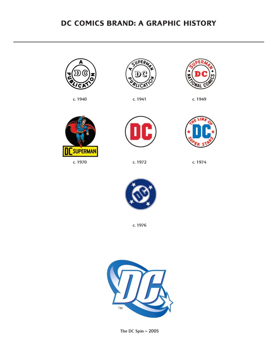
For this assignment we were asked to find 3 logos and discuss the colors used. For the first logo I chose to look at DC Comics. The very original logo was created in 1940 and consists of 1 color, black. For the time it was created having simple colors was cost efficient.


For the second logo I chose the current DC logo. The designer uses monocromatic colors for this logo. For this logo the main color is Blue and I was able to find a interesting connection between this color choice and DC history. The color blue stands for several things such as loyalty, masculinity, and also justice. DC comics is the home to the Justice League which consists of most of the major characters created by the company I thought it was a pretty cool color connection.


For my third logo I chose the Marvel Comics logo. The logo is majorly red and Marvel is in the same font that is still used today. Comics is written in yellow and contrasts off the red.

Tuesday, July 20, 2010

Journal 15

1. Rage- Fire


For these images when I think of rage I think of a person really mad so I wanted to find a picture of that. As soon as I read the word rage I immediately thought of fire because it is fierce like rage.

2. Order- Binder

For these images when I think of order I connect it with organization so I found a picture of a chart that I felt represented order. After I thought of order i thought of a binder just because binders are an easy way to keep a lot of documents organized and in categories.

3. Justice- Court
For these images I chose to use a gavel for Justice. I think of Justice and I think of a court so I chose a picture of a justice court for this word.

4. Evil- Devil


So for Evil I think of something scary and dark so I found a picture that fit both of these qualities. After I read the word though I thought of the devil so I found a picture of that to represent my thought.

5. Peace- Bumper Sticker


For Peace I automatically thought of a Peace sign to use for this picture. I also think of hippies an the 70's so for some reason right after I read peace I thought of bumper stickers.

6. God- Bible

For god I found a representation of him because when I read the word god I think of older paintings of him. I also think of the bible and church so I found a picture of the bible.

7. History- Class


For history it is a really broad word to me so I think of a lot of things. I found a picture on the Internet of a collage of things from history. When i read the word history I thought of class so I found a picture of some students to represent this.

8. Pain- Rollerskating

When I think of pain I think of physical pain so I feel the picture I found is perfect. Also When I read the word pain for some reason I thought of rollerskating and when I was younger falling down ALOT.


9. Smart- scholarship

For smart I found a picture of a head with alot of arrows in the brain area that makes me think of growth and brain power! When I think of smart I also think of a scholarship so I found a picture of thinks that resemble that.

Journal 14

For this assignment we were asked to find an ad in a magazine and analyze it based on its design principles.
For my third ad I found a simple yet very effective ad in my AP magazine. It is an ad for a bands debut album and there are only two colors used in the whole piece, black and white.

The page is bordered with a thick white line and the rest of the page is entirely black. At the bottom of the black box in white letters is says
DEBUT ALBUM 08/04/07
underneath this in much smaller font is reads two website that the band can be heard at.
The focal point of the page is in the middle of the page and black box in white letters it simply reads
LISTEN TO
PM TODAY
This ad is simple and effective. Simple colors, simple and clear message to the reader, simple/ easy to read font. I chose this because not only is it simple but it caught my attention more then any other ad in that magazine while I was flipping through it. Most of the pages in that magazine are overly decorated and makes it hard to determine one ad from another. The creator of this one I feel knew that and decided to be different and keep the ad for this band different and simple, which could also be a depiction of the bands music itself.

Journal 13

For this assignment we were asked to find an ad in a magazine and analyze it based on the design principles.

The second ad I chose was from Surface magazine and it is an ad for a chair.

In the bottom left corner it has the name of the chair

VITRA.

in a bold black font. Underneath that is store information of where the chair can be found complete with address and phone number. The entire ad is a picture and using several design principles to catch a readers eye. There is one chair standing on the bottom right side of the picture from here the designer uses repetition and similarity of the same chair to create a spiral effect flowing into the page. The shape of the chair makes the spiral look like a red spiral staircase this also gives the ad a short of mystical feel to it I believe. It has a very Alice in Wonderland "down the rabbit hole" feel to it with the red, black and white color theme. Red is the primary color used in the ad and it catches the readers attention since it is up against a white background this really makes it stand out.

Journal 12

For this assignment we were asked to find a ad in a magazine and then analysis the ad based on its design principles.


For my first ad, I found a cellphone ad in my Trasworld Snowboarding Magazine. The ad is majorly a picture and there is a white stripe at the bottom with brief information about the phone. In between the white stripe and the picture in bold white stencil style writing surrounded in a black box it says

BUILT TO SURVIVE.
This is obviously the slogan of the phone.
In the top right corner in white font is says
CASIO
which is the brand of phone and is pretty well known. The picture is lacking in any major color or attention grabbing spots. The phone is the focal point of the piece laying in the middle of the picture in a puddle of water and rocks it looks like with water droplets on it. The ad is trying to convey the phone as indestructible to the most well known ways to break a phone. By making this phone waterproof and showing it could survive a fall onto hard rocks could make a lot of people want to buy it who have broken phone in either of these ways.

Journal 11

For this assignment we were asked to have 5 to do this or that decisions.

TO BIKE OR TO DRIVE
Some days I have to decide if I am going to bike to where I need to go or drive. So this logo is a bike and a car, since those are the two choices I have to pick from.
SHOWER or BATH
I decided whether or not I want to take a bath or a shower some days so for this logo I chose a running shower head and a bathtub to symbolize my choices.
TO WORK OR TO CALL IN
Everyday I and most people have to work we are faced with the choice... how badly do we really want to go into work today. I work as a server so for my work picture I chose a dinner platter and for the call in a phone.


LAUNDRY
A couple times a week I am faced with the decision of doing laundry or not doing laundry. To fold or not to fold. I chose a picture of a basket of laundry with a lot of colors and the same picture with a red circle with a red line through it. TO RUN OR TO SLEEP
For the final decision I chose a picture of a runner. Then took the same picture and flip it around so it is upside down looking similar to someone sleeping then in red letters wrote sleep across it.


Sunday, July 11, 2010

Journal 9

For this assignment we were asked to find 10 things we consider to be great inventions. Here is what I have found...


Microwave: A college students best friend. Instant meals for on the go students and pretty much the only method of cooking allowed in dorm rooms.


TV: Obviously it wastes alot of time if someone gets stuck watching it for hours but it is also a good source of information. For weather and news cross country or even cross world it is relayed through television.


In car stereo: I love being able to listen to music and the radio on long road trips. I don't want to try and imagine cars without the radio... awkward quiet.

The Stove: I love cooking and a stove is where I do most of it. I'm also a huge fan of cupcakes :-) which are made in the stove


Vehicles: Seriously were would be all be with out a car. It has made traveling so much easier and less stressful having to rely on trains or horses.


ELECTRICITY! and lamps: Being able to flip a switch when you walk into a room and turn it from night to day. Or not have to walk around in the dark when you wake up in the middle of the night looking for water or while heading to the bathroom.


Bike: I think it is an awesome alternative form of transportation and exercise.


Toilet: Indoor plumbing THAAAANK YOOOU! So much better then having to go outside or a portapotty or an outhouse... really one of the best inventions if I say so myself.


Gaming Systems: I think this is a great invention because it has allowed individuals to expand there creativity. By playing or creating the games its lets the person get away from the real world and relax.


Fans: I like this invention because it allows a room full of stale hot air to be refreshed. Also when a person come


We were also asked to find 10 things (besides a person) we could not live without.

A Blender: I love smoothies and milkshakes having one of these handy appliances around keeps me healthier and happy :-)

Fridge: who doesn't love leftovers? having a fridge and freezer lets me keep food longer and fresher then old times were you had to eat everything right away.


Internet, Laptop: I don't know what I would do without these things. Being able to stay connected to family and friends through email or IM. Get news or research quicker then waiting for it to come on TV.


Cellphone: Being able to call anyone anywhere. genius. I don't have to wait to be home to get a message or call being able to get a hold of people or have them get a hold of me is comforting. Also having the Internet and email on a phone lets you stay even more connected.


DVD player: Just movies in general. I love movies and having CD's instead of bulky VHS makes traveling with them easier.


Shower: Being clean. Enough said.


Shoes: LOVE EM! also they protect our feet so whats not to like. Specially when they are cute shoes.


Washer/ Dryer: even though I hate doing laundry having these two machines to do it makes it so much easier then having to hand wash everything you have.


Coffee Maker: YUM coffee. Delicious and you can heat water with it for tea or other things that need hot water.