Carpe Diem
This blog was created for my VC 101 journal entries. We'll see how this goes.
Tuesday, July 27, 2010
Journal 19
For this assignment we were asked to find a ad using a myth.
Our book describes a myth as this:
"In today's society the modern myths are built around things like notions of masculinity and femininity, the signs of success and failure, what signifies good health and what does not."
Here is an ad I found using a myth.
In this ad for Heineken two bottles are duct taped on opposite sides of a game cube controller. The ad also has the phrase:"Its game day."
This ad is targeting its male readers. Implying that older men who play video games also drink beer at the same time. The phrase "its game day" can lead the reader to think about a number of things, either playing video games, going out and playing a game, or watching a game on TV. This would get the male reader to think about getting beer when he goes out to do any of these "game" related activities.
Monday, July 26, 2010
Journal 18
For this assignment we were asked to find a ad that used Frank Jefkin's 3 basic design principles:
Precise
Concise
and
The ad says
"if it's not fixed by the one who made it, it probably wont work"
The ad was designed for Chevrolet's service department and this is one of a series of 3 ads all with the same basic idea. Overly worked on faces of people that just don't look right anymore.
This is the ad I found that I feel fits these 3 rules because
1. it is precise because it is a very simple ad and gets to the point quickly. After you read the ad look at the picture then see the Chevrolet logo you understand the message they are trying to send.
2. is is concise because it is saying what it has to say in the fewest words possible.
3. This ad has interest and value to the reader not only to the Chevrolet company but this ad kind of speaks for all companies. I know I wouldn't want my car turning out like that woman's face by taking it to other places.
Journal 17
For this assignment we were asked to find a 2 page ad and analyze the color used.
I found this 2 page Marlboro ad online. The design of the ad is a silhouette of a desert and a man on a horse (the Marlboro man) with a star filled night time sky filling the rest of the page. Across the top of the page it says in a white font"Merry Christmas from Marlboro Country"
I feel that this picture fits perfect in reflecting a "Christmas" vibe. The white stars contrasting against the dark blue remind me of christmas lights and how closely they are clustered reminds me of snow. Even though darker colors are supposed to make you feel cold or sad in this ad they are almost warming.
Journal 16
For this assignment we were asked to find 3 logos and discuss the colors used.
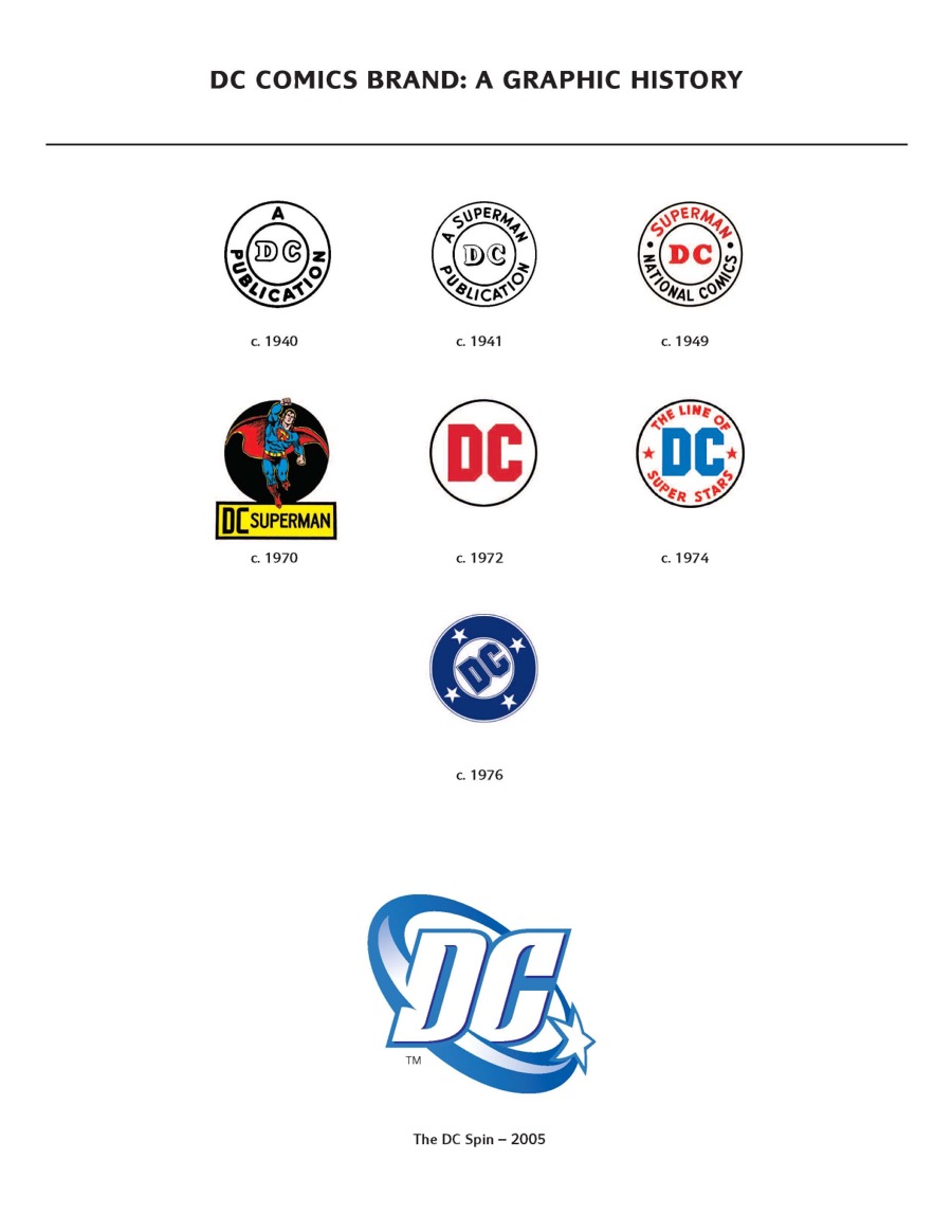
For the first logo I chose to look at DC Comics. The very original logo was created in 1940 and consists of 1 color, black. For the time it was created having simple colors was cost efficient.
For the first logo I chose to look at DC Comics. The very original logo was created in 1940 and consists of 1 color, black. For the time it was created having simple colors was cost efficient. For the second logo I chose the current DC logo. The designer uses monocromatic colors for this logo. For this logo the main color is Blue and I was able to find a interesting connection between this color choice and DC history. The color blue stands for several things such as loyalty, masculinity, and also justice. DC comics is the home to the Justice League which consists of most of the major characters created by the company I thought it was a pretty cool color connection.
For my third logo I chose the Marvel Comics logo. The logo is majorly red and Marvel is in the same font that is still used today. Comics is written in yellow and contrasts off the red.
Tuesday, July 20, 2010
Journal 15
1. Rage- Fire
For these images when I think of rage I think of a person really mad so I wanted to find a picture of that. As soon as I read the word rage I immediately thought of fire because it is fierce like rage.
2. Order- Binder
For these images when I think of order I connect it with organization so I found a picture of a chart that I felt represented order. After I thought of order i thought of a binder just because binders are an easy way to keep a lot of documents organized and in categories.
For these images I chose to use a gavel for Justice. I think of Justice and I think of a court so I chose a picture of a justice court for this word.
4. Evil- Devil
So for Evil I think of something scary and dark so I found a picture that fit both of these qualities. After I read the word though I thought of the devil so I found a picture of that to represent my thought.
5. Peace- Bumper Sticker
For Peace I automatically thought of a Peace sign to use for this picture. I also think of hippies an the 70's so for some reason right after I read peace I thought of bumper stickers.
6. God- Bible
For god I found a representation of him because when I read the word god I think of older paintings of him. I also think of the bible and church so I found a picture of the bible.
7. History- Class
7. History- Class


For history it is a really broad word to me so I think of a lot of things. I found a picture on the Internet of a collage of things from history. When i read the word history I thought of class so I found a picture of some students to represent this.
8. Pain- Rollerskating
When I think of pain I think of physical pain so I feel the picture I found is perfect. Also When I read the word pain for some reason I thought of rollerskating and when I was younger falling down ALOT.
9. Smart- scholarship
For smart I found a picture of a head with alot of arrows in the brain area that makes me think of growth and brain power! When I think of smart I also think of a scholarship so I found a picture of thinks that resemble that.
Journal 14
For this assignment we were asked to find an ad in a magazine and analyze it based on its design principles.
For my third ad I found a simple yet very effective ad in my AP magazine. It is an ad for a bands debut album and there are only two colors used in the whole piece, black and white.
The page is bordered with a thick white line and the rest of the page is entirely black. At the bottom of the black box in white letters is says
DEBUT ALBUM 08/04/07
underneath this in much smaller font is reads two website that the band can be heard at.
The focal point of the page is in the middle of the page and black box in white letters it simply reads
LISTEN TO
PM TODAY
This ad is simple and effective. Simple colors, simple and clear message to the reader, simple/ easy to read font. I chose this because not only is it simple but it caught my attention more then any other ad in that magazine while I was flipping through it. Most of the pages in that magazine are overly decorated and makes it hard to determine one ad from another. The creator of this one I feel knew that and decided to be different and keep the ad for this band different and simple, which could also be a depiction of the bands music itself. 
Subscribe to:
Posts (Atom)